DocuSign Insurance Dashboard
Paperless Options
Situation:
This insurance company still used wet sign in the underwriting process. Agents were responsible from gathering and archiving paper documents. We needed a modern solution.
Task:
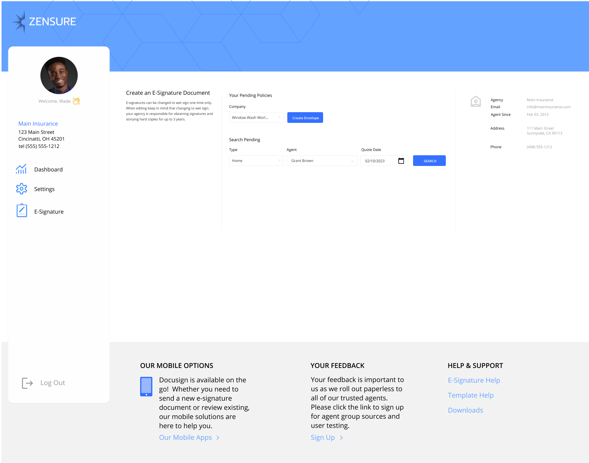
The goal was to implement the Docusign API and revolutionize our agent experience. The agents will not be entering their client information, only adding the e-signature process.
Action:
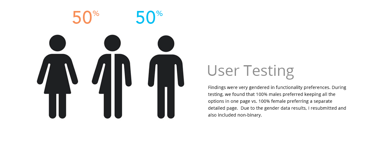
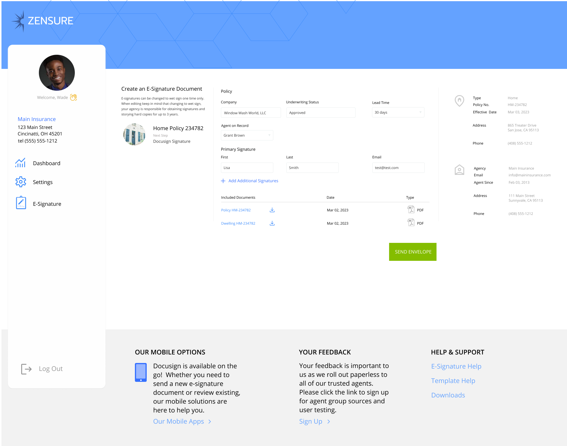
I set out to interview agents and create user testing for preferences on detailed page vs. using the DocuSign caret drop down option. Findings were 100% male preference keeping all the options in one page vs. 100% female preferring a separate detailed page. Due to dev preference, we went with a separate page as we had a lot of specific functions to this insurance company, such as changing back to wet sign during the process for those that wanted the option to back out. Due to the very gendered data results, I also submitted for non-binary user testing, however I did not receive any feedback using that setting.
Result:
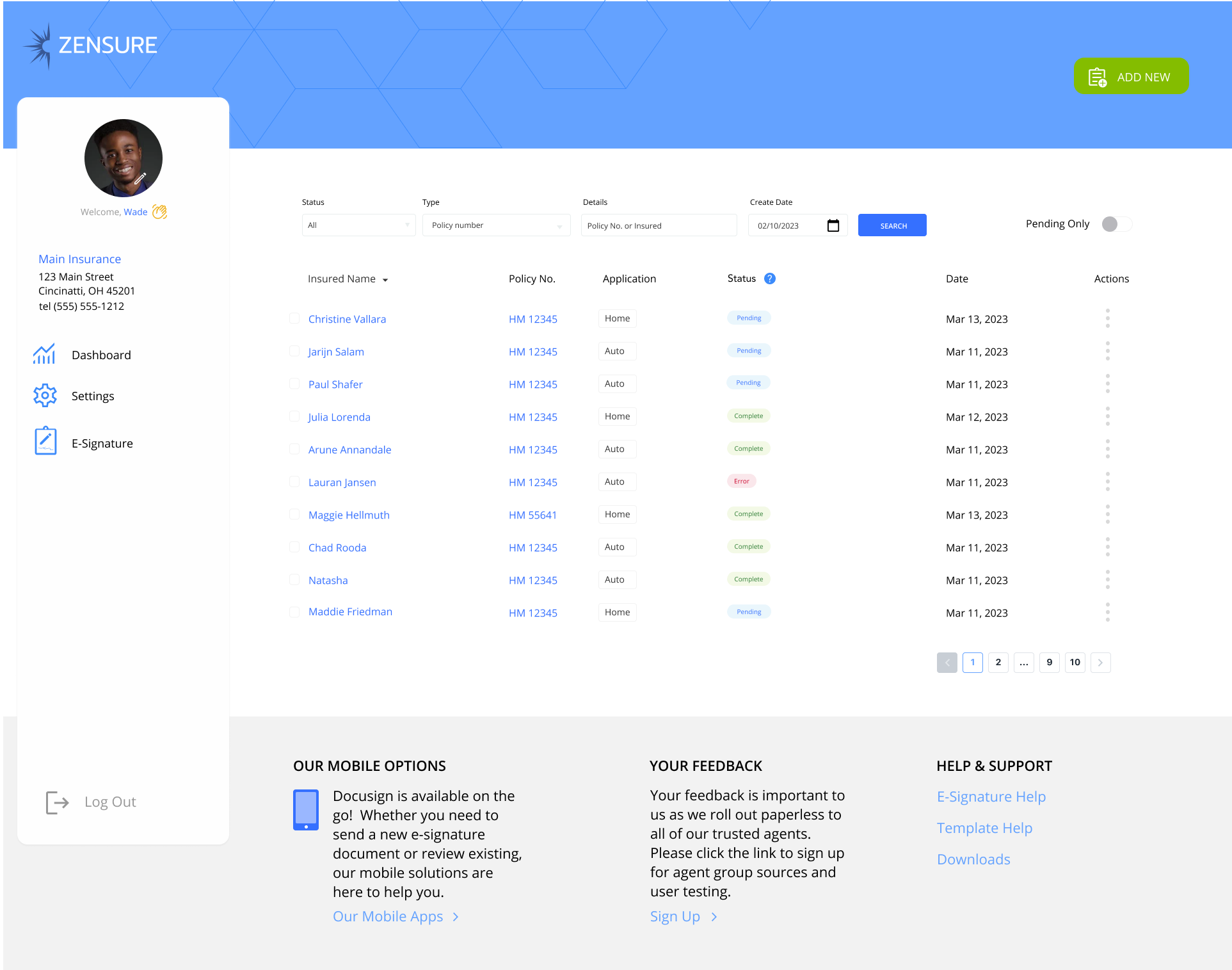
As a result, I designed and tested a successful agent dashboard for e-signature. The features included pending and sent status, a filter for agent preference to only view actionable items, a resend option and changing to wet sign in the details page.


